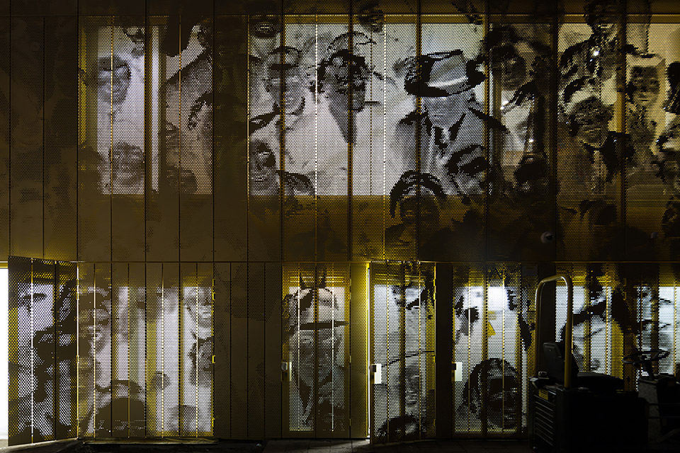
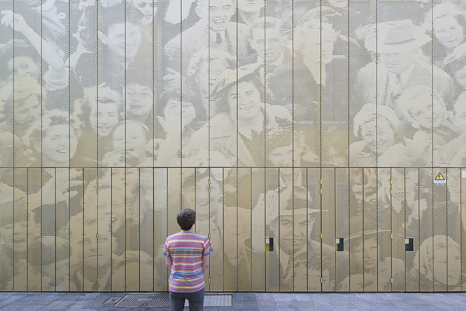
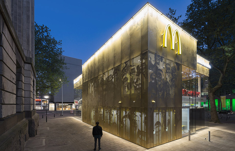
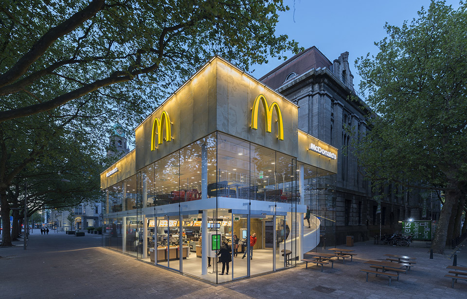
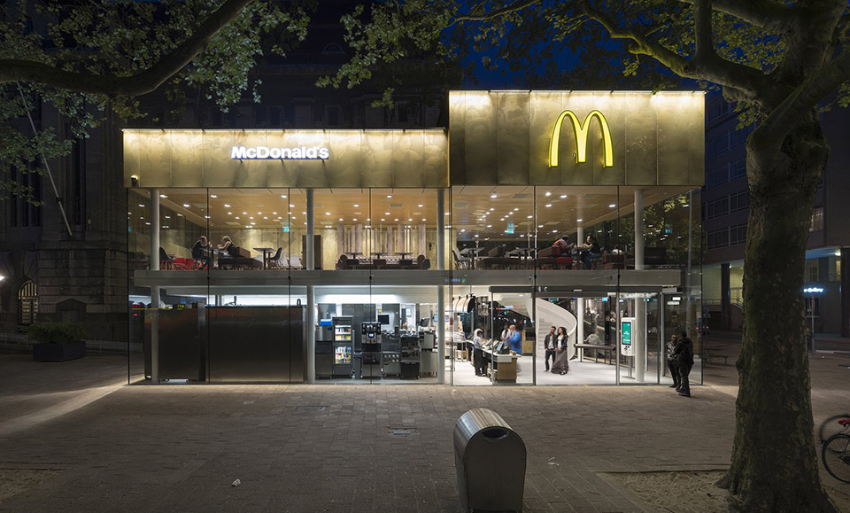
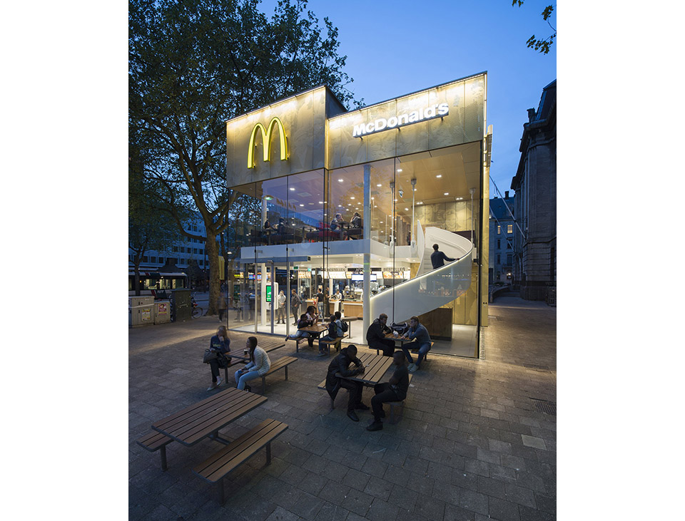
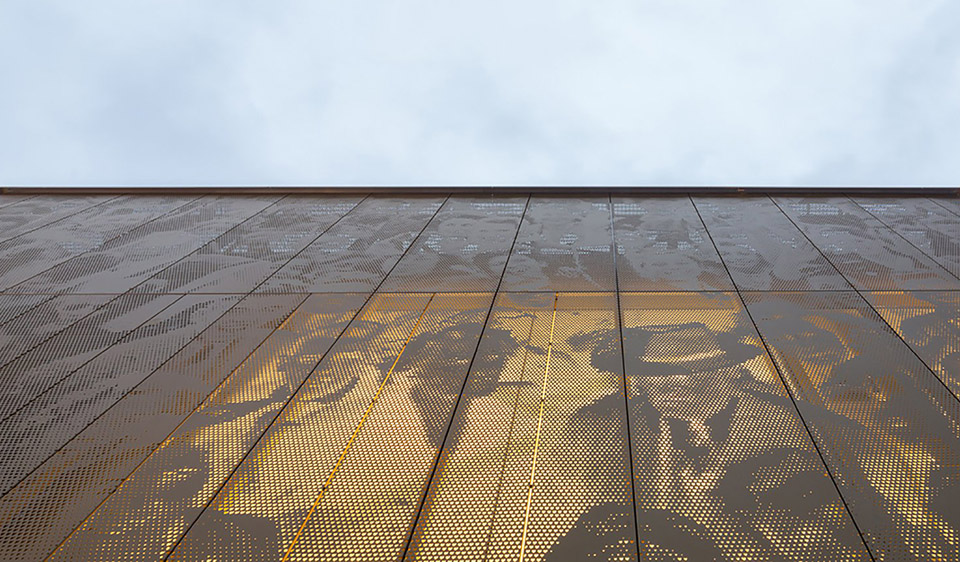
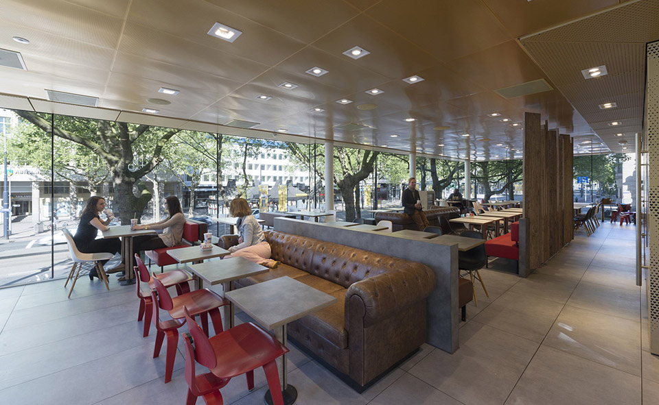
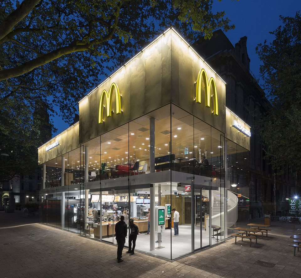
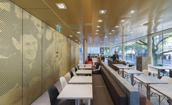
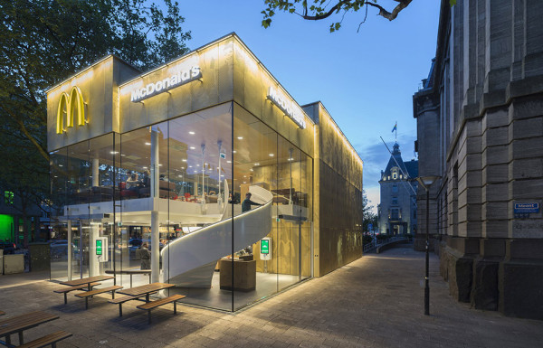
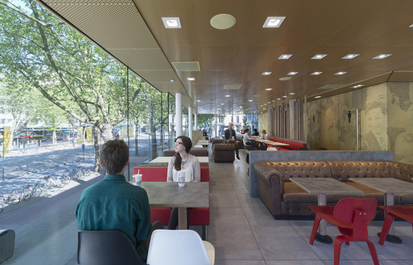
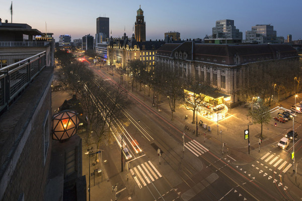
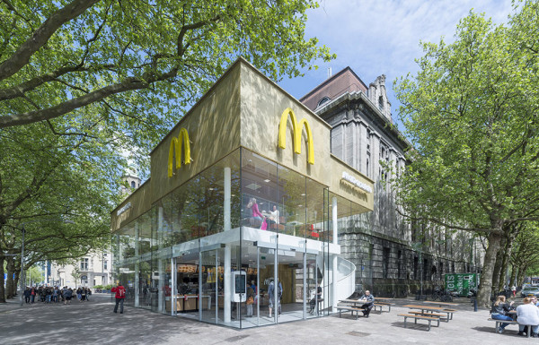
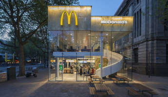
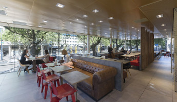
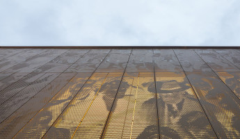
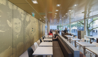
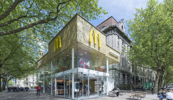
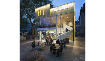
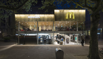
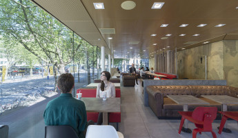
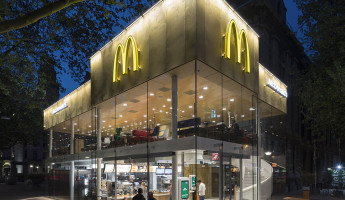
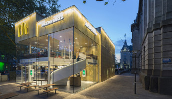
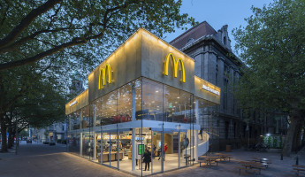
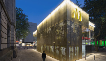
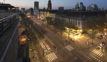
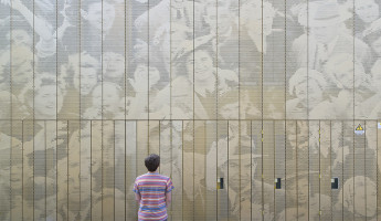
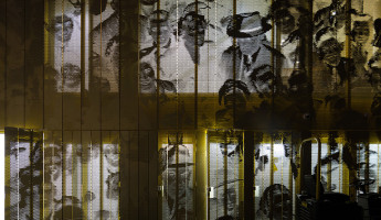
The McDonald’s pavilion is located on one of Rotterdam’s most well-known avenues, a divided commercial district called Coolsingel. The McDonalds of the Future occupies a space that was once considered to be Rotterdam’s ugliest building, but this new design is an exercise in contrasts. What was once an ugly blight is now a vibrant new structure. It may be a popular consumer brand that operates the space, but it’s a design worthy of celebration for the local citizens. New architecture is no stranger to McDonalds and other fast food retail brands. Once a decade or so, brands invest in new design to refresh their stores and recirculate customer traffic. As stores age, so does a brand’s image, so they invest in new designs that communicate something new about their identity. That’s what makes this design by Mei Architects so special. It might appear to be a one-off design, destined to stand alone in Rotterdam, but it could also signal something new for McDonalds. The McDonalds of the Future could be guided by this design. I hope to see elements from this one in my own local stores. To borrow a phrase, I’m lovin’ it. [photography by jeoren musch]
The McDonalds of the Future | Gallery
